Health-i + Blue Cross Blue Shield
Goal: Develop an application where people can manage their health information.
What I did: Streamlined the process of organizing health records on a platform that is always with the patient.
How long it took: 2 weeks.
What is Health-i?
Managing your healthcare can be time-consuming and confusing -- managing prescriptions, doctors appointments, medical records, etc. Whether you are older or young, healthy or sick, it is important to always have your health in mind.
You don’t have one doctor, you have a team of doctors. This product from Blue Cross is to keep your team in one place. Think EHR (electronic health records), but for the patient.
The Task
The task was to develop an application that helps the user manage their health records and other health information. The reason for this is to give the user access to all their pertinent health information anywhere they go.
Many people keep their records in a file cabinet or on a computer folder, but in the event of an emergency, you need this information with you. This is where Health-i comes in.
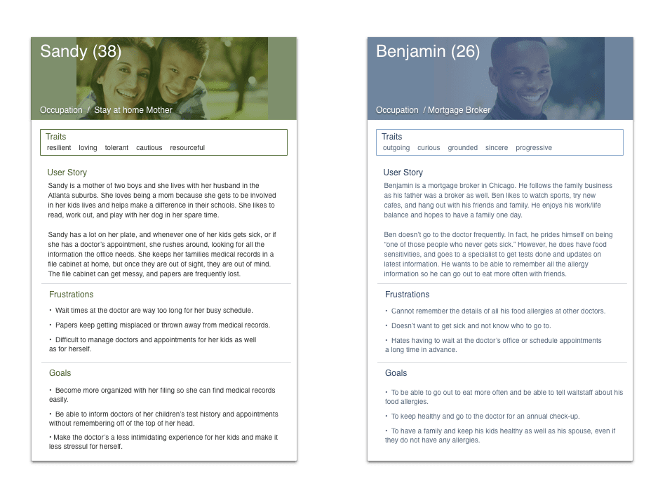
I interviewed five participants of varying ages and occupations. The age range of people interviewed was 23-40 years old.
The most common answer to the question regarding the most frustrating part of going to the doctor was wait time. Another pain point is misdiagnoses or the nature of the appointment with surprise tests and other unplanned scenarios. As far as changing the medical care services, the participants said they would like to cut down wait times and make it easier to access pertinent information.
The adjectives used to describe the medical care system are things like cold, scary, slow, and time consuming. The adjectives that the participants want to describe the medical system in an ideal setting are things like empathetic, quick, streamlined, and supportive.
I created two personas during my process because I wanted to explore the user's journey from two different viewpoints. One persona is a single user of the product, the other is a mother of two who has to manage records not only for herself, but for her husband and children as well.
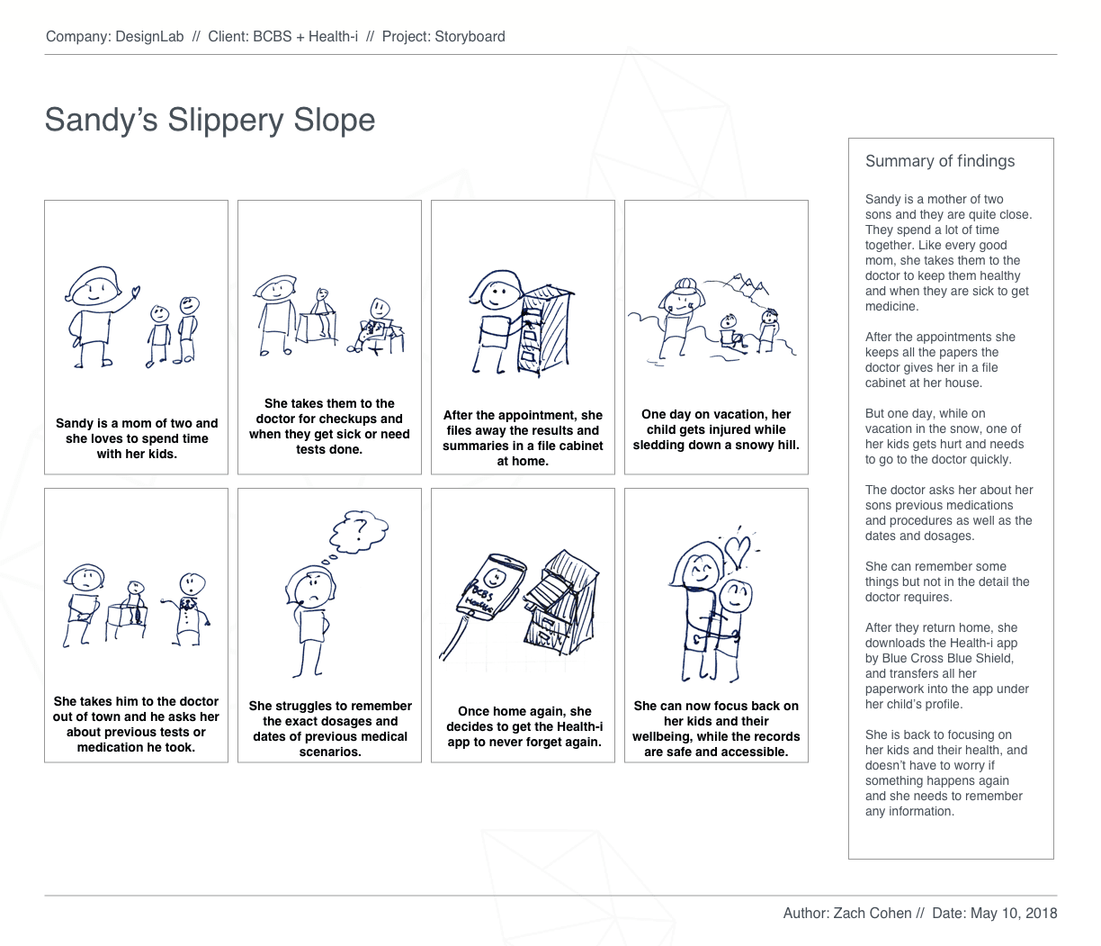
Creating a storyboard allowed for me to represent how a potential user could discover the product and how it would solve their problem or fit into their life.
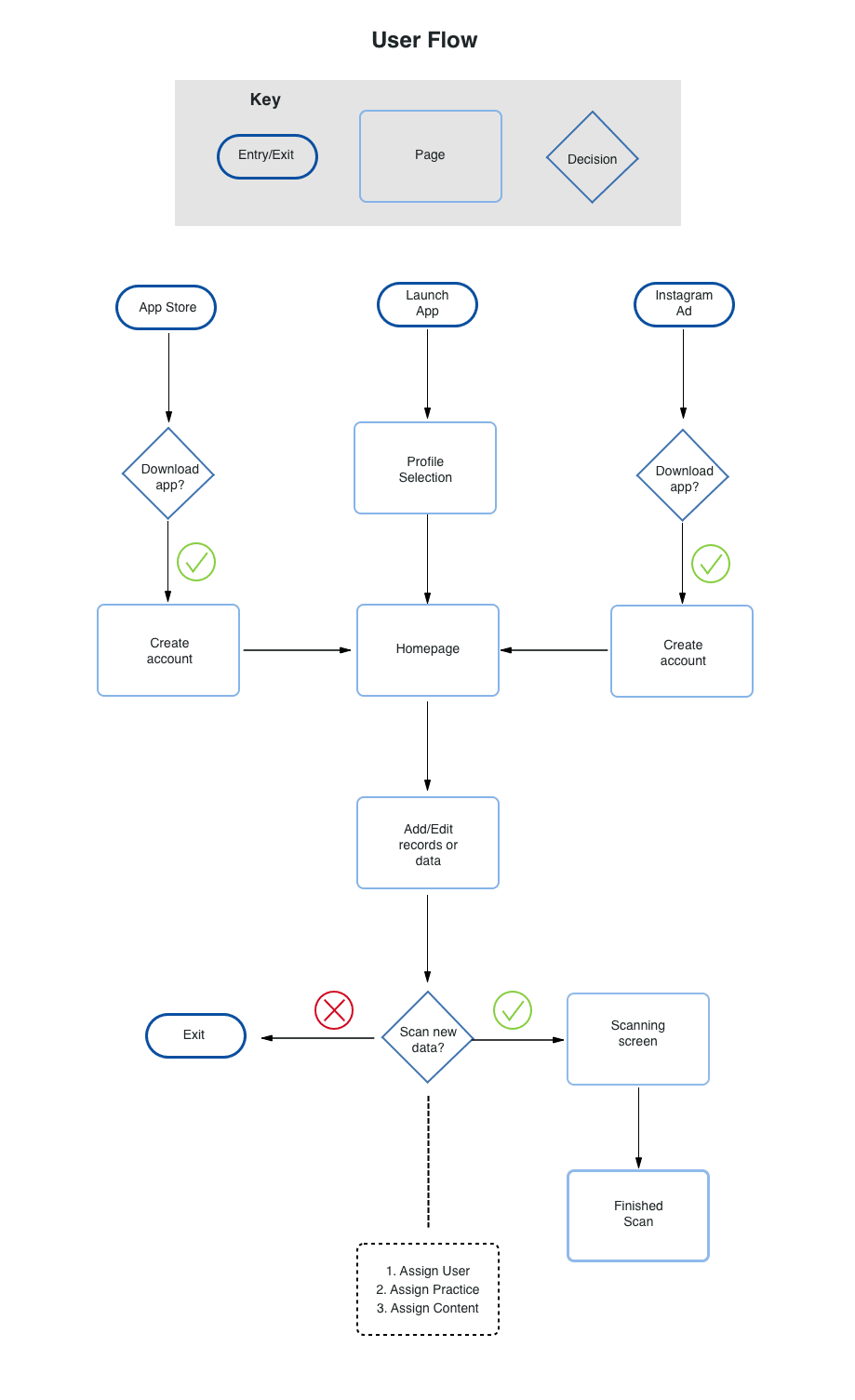
Viewing the information in a different way is important to my process because I like to visualize the concept from as many perspectives as possible. Here is the user flow that shows how a user gets to the main screens and what they are looking to accomplish.
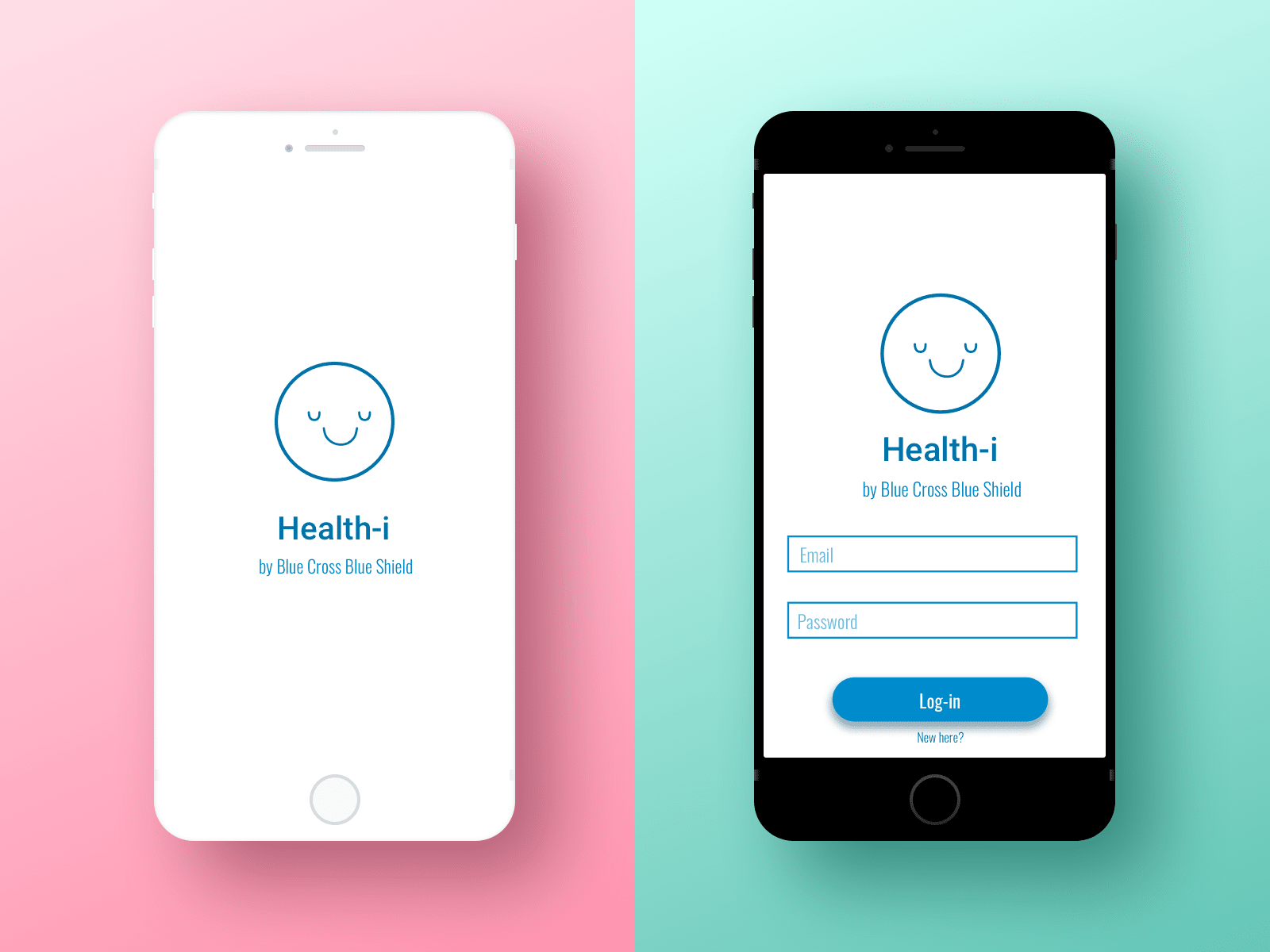
Now that I know what screens I need to create, I draw up low-fidelity wireframes. I do this for visual hierarchy and arrange the information that allows the user to complete their tasks as easily as possible.
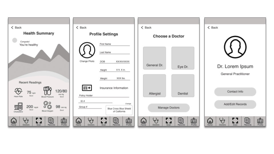
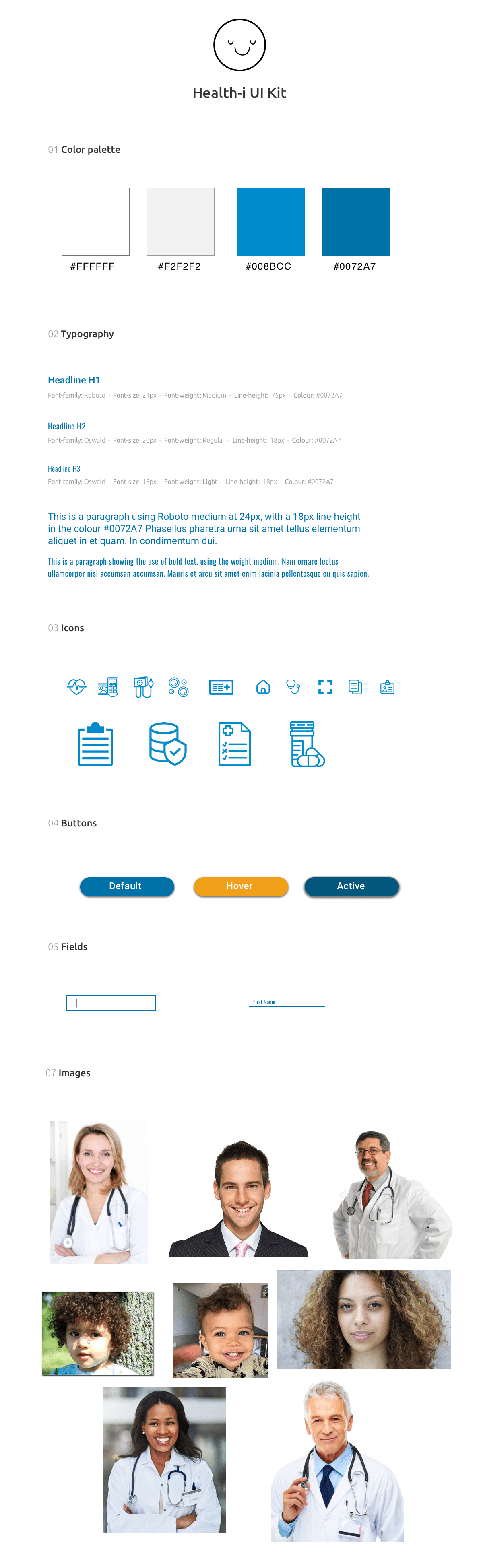
After approval, I add the UI elements and images to make the screens come to life. Remembering that this application is supposed to make healthcare less scary and make holding on to your records more intuitive, I assembled my elements with a UI kit. Keeping with the Blue Cross guidelines, I used the same blues and typography as they do.
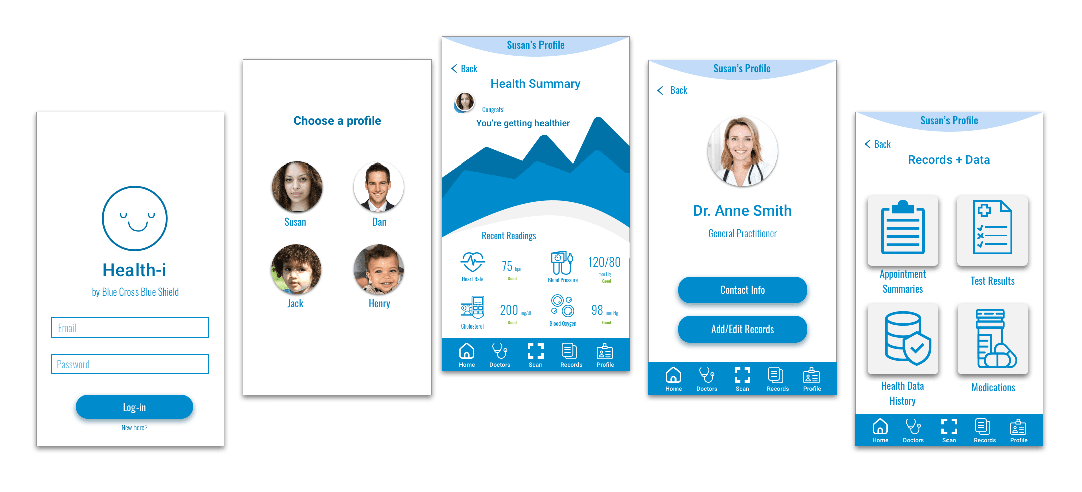
When all the elements are wrapped up together, I make the high-fidelity wireframes and whatever other changes need to be made to the interface. Once the screens are complete, I can usability test a prototype for further iteration.
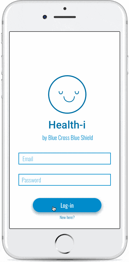
This usability study was conducted using a high fidelity prototype of the Health-i smartphone application. All tests were conducted on a smartphone using the InVision prototype.
The participants were instructed to scan new records of their paper records as well as attempt to view their general doctor's information.
The participants include: three women (ages 22, 35 and 47), and one man (age 26). Several tests were conducted in person via smartphone and several were conducted remotely via desktop.
All participants were able to make it through the prototype with no major issues. A pattern that many participants spoke about was the amount of content included in the prototype. Due to time constraints, I could include everything I wanted in the prototype and test, which left some content to be desired. Several participants spoke about the brand identity as similar to Blue Cross Blue Shield, as well as the overall feel of the prototype being more friendly than a usual medical app.
• People are very critical of the medical care system in general, and are skeptical of medical apps as a result. Once the purpose is explained and a good task flow or storyboard demonstrates the product's importance, there is less pushback from the users.
• When creating a prototype that will be tested, be sure to include screens for all buttons or elements intended to eventually be clickable. This way, you can get the most accurate results from the participants.
• The medical care field is tricky, because there is a lot of red tape around most operations and the way things are done. I took a direction that put the power in the hands of the patient for this reason, but in a more advanced world, the providers would definitely have input in the product.